
Fibonacci Arc is a technical analysis indicator and is utilized to give hidden support and resistance levels for security. It is built by drawing a trend line between two swing points on a chart.

In finance, Volume-Weighted Average Price (VWAP) is a ratio of the profit traded to complete volume traded over a distinct time horizon – normally one day. It’s a portion of the average price a stock traded at over the trading horizon.
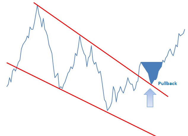
A pullback is a technical analysis term used frequently when a stock “pulls” back to a resistance and/or support line, usually after a breakout has occurred. Pullbacks can be in an uptrend or downtrend and can pull back upwards or downwards. In the example below we can see a pullback as it retraces back to Read More…
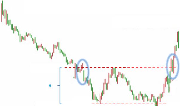
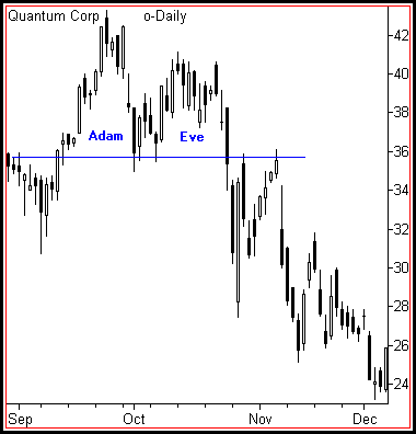
Double Bottoms are reversal patterns and often seem to be one of the most common (together with double top patterns) patterns for currency trading. Double Bottoms patterns are identified by two consecutive low prices of the same depth with a moderate pull back up in between (neckline peak).

The head-and-shoulders pattern is one of the most popular chart patterns in technical analysis. The pattern looks like a head (the middle peak) with two shoulders (two equal heiight peaks).

Technical analysis software automates the charting, analysis and reporting functions that support technical analysts in their review and prediction of financial markets (e.g. the stock market).

A cup-and-handle chart pattern resembles a cup of tea. These are bullish continuation patterns where the growth has paused. momentarily, it trades down and then continues its upward pattern. This pattern must always be at least 5 weeks long and can last up to a year.

The options collar strategy is designed to limit the downside risk of a held underlying security. It can be performed by holding a long position in a security, while simultaneously going long a Put and shorting a Call.

A straddle is an investment strategy that involves the purchase or sale of an option allowing the investor to profit regardless of the direction of movement of the underlying asset, usually a stock.
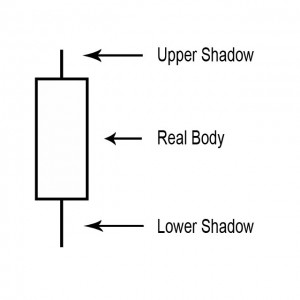
For a candlestick chart, the body or real body is the wide or colored part of a candle that represents the range between the opening and the closing prices over a specific time period (minute, hour, day, week or other). They are the most basic building block for candlestick charts.
A point on a candle stick chart representing a specific time period (a day, an hour, a minute, etc) in which the underlying stock price has moved. Candlesticks will have a body and usually two wicks – one on each end. For a white (could also be green) candlestick, the bottom of the body represents the opening price and the top of the body represents the closing price. For red candlesticks, it is just the other way around. The top and bottom tips of each wick are the day’s highest and lowest price respectively.
A small line (like a candle wick) found at the top or bottom of an individual candle in a candlestick chart.
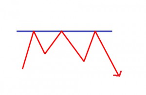
A point or range in a chart that caps an increase in the price of a stock or index over a period of time. An area of resistance, resistance line or resistance level indicates that the stock or index is finding it difficult to break through it, and may head lower shortly. The more times that the stock or index tries unsuccessfully to break through the resistance line, the stronger that area of price resistance becomes.

A series of technical indicators used by traders to predict the direction of the major financial indexes.

Chart analysis is the same as Technical Analysis. It is mostly concerned with price and volume.

In the world of stock analysis, fundamental and technical analysis are on completely opposite sides of the spectrum. Earnings, expenses, assets and liabilities are all important characteristics to fundamental analysts, whereas technical analysts could not care less about these numbers and only focus on price and volume.
A phrase used for a stock where the price has dropped significantly in a short period of time. A falling knife security can rebound, or it can lose all of its value where the shares become worthless.
You do not need anything else on a stock chart but the candles themselves to be a successful swing trader! And, there is nothing that can improve your trading more than learning the art of reading candlestick charts

Resistance and support levels are widely used by experienced traders to formulate trading strategies. For example, if a stock is approaching a very strong resistance level, a trader may prefer to close the position rather than take the risk of a significant decline if the stock uptrend reverses.

An inverted dead-cat bounce is quite the opposite of the dead-cat bounce. A quick look is if a trader owns a stock following a quick and large (5-20%) gain there is normally a gap up. If you sell on the next day after the gap up day, thus unlocking profits its because prices normally start falling before beginning a new move upward (Bulkowski, 2005).

A trading term called a dead cat bounce is used to when a stock is in a severe decline and has a sharp bounce off the lows. It occurs due to the huge amount of short interest in the market. Once the supply and demand has become unbalanced, any type of bear market rally will create a massive short covering which will lead to a swift price move up. This bounce will be short lived and followed up by heavy selling which will break the prior price low.

A gap in a chart is basically an empty space between one trading period and the one prior to that trading period. They normally form on account of an important and material event that will affect security, like an earnings surprise or a merger agreement.
Flags and Pennants are categorized as a continuous pattern. They normally represent only brief pauses in a dynamic stock. They’re typically seen immediately after a quick move. The stock will then take off again in the same direction. Research shows that these patterns are many of the most reliable continuation patterns. Take a look at typical Flags and Pennant pattern.

The V top is a reverse V-shaped top thus the name. The top is quite sharp. It’s due to the irrationality of actors leading to a steep increase that will be corrected shortly afterwards. The V top will occur most often in an upward trend and will often signal a trend reversal. It can also appear in a downward trend, like when in an economic announcement.

The V bottom is shaped like a V thus the name. The dip will be quite sharp. It’s because the irrationality of actors leading to a steep fall which will be corrected shortly after. The V bottom will occur most often in a downward trend and will generally offer a signal trend reversal. It can also appear in an upward trend (like in an economic announcement).

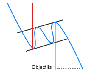
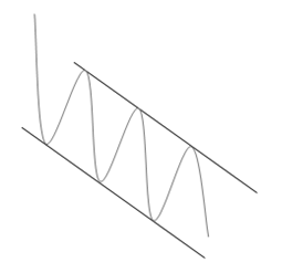
A horizontal channel is a pattern that underlines investor’s indecisiveness. This horizontal channel is assembled by two horizontal and parallel lines that build the progress of the price. To confirm a line, there should be at least two points of contact with the price. The more contact points it will has, the more these will be durable and their breakout will give an substantial buy/sell signal.
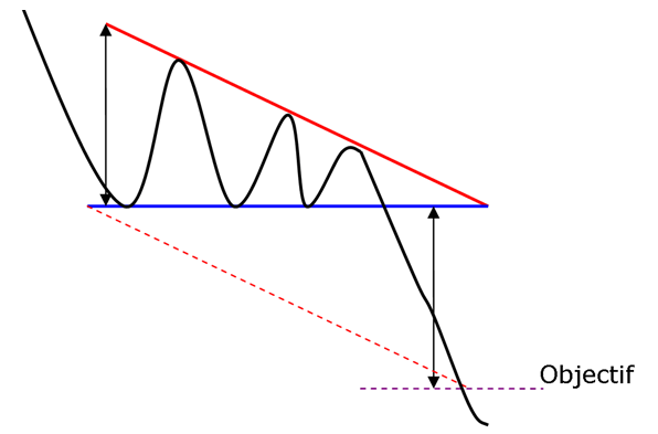
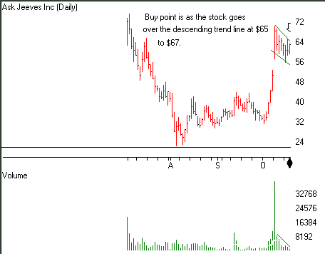
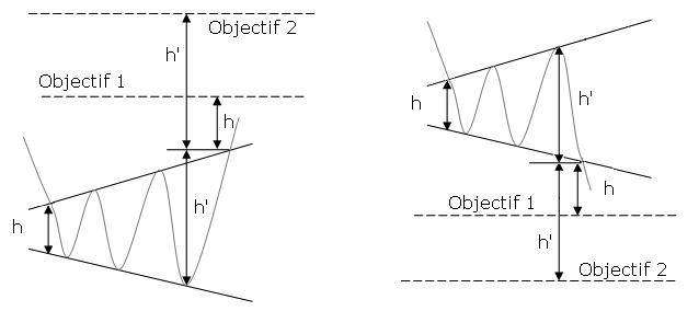
The descending triangle is a bearish continuation pattern. This pattern forms two converging lines. The initial is a downward slant which resistance and the other is a horizontal support. To validate the descending triangle, there must be oscillation between the two lines. The lines must be touched at least twice for validation.

The symmetrical triangle top is a bullish continuation pattern. This pattern forms two trend lines which are symmetrical to the horizontal and convergent. The initial pattern is a bearish slant that gives resistance and the other is a bullish slant that will be the support. To prove a symmetrical triangle top, one must have oscillation between the two lines. Each of these lines must be touched at least twice for validation.

A symmetrical triangle bottom is a bearish continuation pattern. This pattern forms two trend lines that are symmetrical to the horizontal and convergent. The initial one is a bearish slant that gives support and the other will be a bullish slant that will create a resistance. To prove a symmetrical triangle bottom there must have oscillation between the two lines. Each line has to touch at least twice for validation.

The ascending triangle is a bullish continuation pattern. This pattern is made by two converging lines. The first line is an upward slant which is the support and the other is a horizontal resistance line. To validate the ascending triangle, there has to be an oscillation between the two lines. Each line has to be Read More…
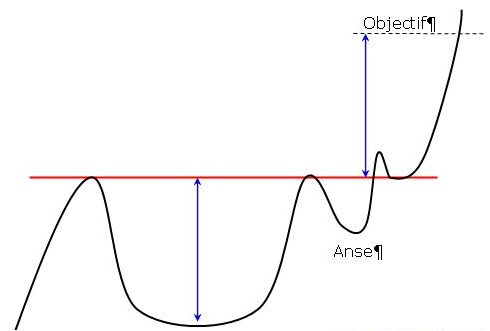
The cup with handle has a continuous pattern. This pattern is formed by two rounded bottoms, the first is deeper and wider than the second. The height of the cup and the handle will be aligned along a straight horizontal resistance. This is the neckline of the pattern.

The rounding top pattern is a reverse U-shape, also called a “reverse saucer. ” The top is rounded with a flat top. But as you’ll see in many cases there are several bullish peaks and they will not put in question the validity of the pattern.

The U-shaped bottom is a rounding bottom, also called a “saucer. ” The dip is rounded with a flat bottom. But we’ll see in many cases there are several bearish peaks, but they do not question the validity of that pattern.
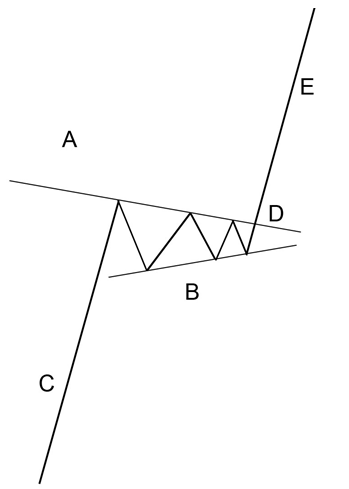
The pennant resembles the symmetrical triangle, but it’s characteristics are not the same. The pennants is shaped like a wedge of consolidation. Its normally appears after a sudden upward or downward movement. The life of a pennant is short according to the time frame used.

The descending flag shows as a continuation pattern. The flag is built by two straight downward parallel lines which is shaped like a rectangle. It is oriented in the direction of that trend which it consolidates. Contrary to a bearish channel, this pattern is quite short term and shows the fact that buyers will need a break.
An ascending flag is a continuation pattern. The ascending flag is formed by two straight upward parallel lines which are shaped like a rectangle. It is adjusted in the direction of the trend that it consolidates. Contrary to a bullish channel, this pattern is quite short term and marks the fact the seller will need a break.

A bullish channel is called a continuation trend pattern. The bullish channel is assembled by two parallel lines that frame the upward price trend. A line is validated when there has been at least two points of contact with the price. The more contact points it has, the stronger the trend line is and the more their breakout will give a strong sell signal.
A bearish channel is a continuation trend pattern. The bearish channel is arranged by two parallel lines that frame the downward price trend. To certify a line, there has to be at least two points of contact with the price. The more contact points it has, the more the trend line is stronger and their breakout will give a stronger buy signal.

The triple top is a bearish pattern with an MN shape. Three bottoms will come in succession, reflecting an important resistance. This marks a reversal will.

Reverse head and shoulders is a trend reversal pattern. It will mark a desire to make a bullish reversal. The theory is the same as a triple bottom other than the second bottom will be lower than the others, which are technically at the same height. The reverse head and shoulders pattern will be formed by three bottoms that will succeed.
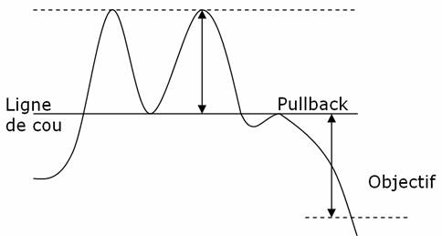
The double top is a bearish pattern shaped like an M. Two tops must succeed, imaging an important resistance. This marks a reversal. The pattern may also be in WV shape. We can consider a triple top as well.

A reversal pattern is called a diamond bottoms. This pattern is formulated by two juxtaposed symmetrical triangles. It is shaped like a diamond.

A falling wedge is a bullish reversal pattern made by two converging downward slants. To prove a falling wedge, there has to be oscillation between the two lines. Each of the lines must be touched at least twice for validation.

A bearish reversal pattern formed by two assembled upward slants is called a rising wedge. To validate rising wedge there must be oscillation between the two lines. These lines must be touched at least twice for validation.
Stock charts print different topping formations. Some are classics, like the Descending Triangle, which can be understood and traded with little effort. However the emotional crowd additionally generates many undependable patterns while greed slowly evolves into mindless fear. Complex Rising Wedges will challenge a technician’s best effort at prediction while the unusual Diamond pattern burns trading capital swinging randomly back and forth.
The formation, ascending broadening wedge is called this because of its similarity to a rising wedge formation and then has a broadening price pattern.

The right-angled and ascending broadening chart pattern is not one you might choose to trade. Other chart patterns perform much better. Downward breakouts have a big break even failure rate which may disqualify them from your trading tools. Upward breakouts have only a middling average rise, and that is if you trade them perfectly.
The broadening bottom is one of those chart patterns that appears often, but you might want to avoid trading. The performance rank approaches the bottom of the list with a comparatively high break even failure rank and low average rise in a bull market. Its only redeeming value is the partial decline which does an excellent job of predicting an upward breakout.

Technical Analysis is the use of technical indicators comprising of statistics using past market information to predict which direction the security price will move.

The Average True Range (ATR) is an indicator that measures volatility.
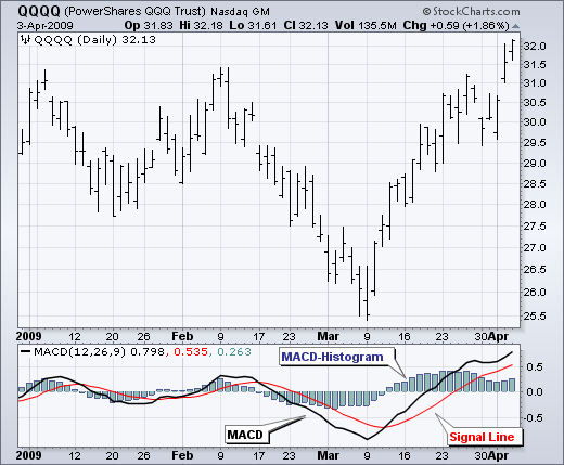
The Moving Average Convergence-Divergence (MACD) indicator is one of the easiest and most efficient momentum indicators you can get. It was developed by Gerald Appel in the late seventies.

Moving Averages Moving Averages are one of the most popular and important technical analysis tools. The ease of use and simple calculation make it a great tool to get information quickly. They also provide the basics for more advanced technical analysis tools like MACD and Bollinger Bands and can be useful for removing some of Read More…

Volatility is founded on the standard deviation, which modifies as volatility expands and declines. The bands spontaneously widen when volatility expands and narrow when volatility declines.
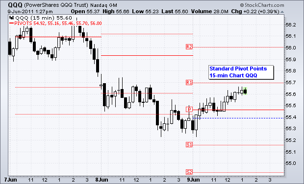
Pivot Points use the previous period’s high, low and close which will define future support and resistance. Pivots Points are important levels chartists utilize to decide directional movement, resistance and support
“Learning is not attained by chance; it must be sought for with ardor and attended to with diligence.” – Abigail Adams (1744-1818) Google (NASDAQ: ) You may have heard of technical analysis before or maybe you’re wondering what all the squiggly lines on ’s chart above represent. Those lines are a result of technical analysis. Technical analysis Read More…

Is Technical Analysis voodoo? Contrary to what some people think, Technical Analysis is not a kind of black magic or sorcery. Also, the use of technical analysis does not increase as we get closer to Halloween. It is important to keep an open mind and realize that things such as trend lines, triangles, and other Read More…