7-01 How to Read Stock Charts
This chapter will expose you to the most common charts available. Their names and meanings are important to your continuing education and the number of tools you carry in your toolbox in order to evaluate stocks.
Understand that it will take some time before you are comfortable reading and interpreting many of these charts. Don’t become discouraged, as many experts will happily tell you that it took them years to develop a high-level ability to read stock charts. But chart reading is just like anything else. Spend 15 minutes a day, start reading what other people are seeing, and you will be surprised how quickly you start to see patterns yourself in stock prices.
Also, as many experts can tell you, reading these charts is an art, not a science. However, becoming a better chart reader will undoubtedly improve your “bottom line” for your investment career.
Let’s lay out the absolute basics of what a stock chart is: A stock chart shows you the history of a stock’s price over time. Price is on the vertical or y-axis of the chart, and time is on the horizontal or x-axis. The same concept applies on any chart, over any timeframe. From monthly to 1-minute charts the concept does not change. This can be displayed over different chart styles, (Mountain, OHLC, Candlesticks, Renko, etc.).
Thankfully, there are a few variables that you can use to control how your charts are displayed.
- Time – You can have stock charts that show minutes, days, weeks, months or even years’ worth of price history.
- Chart Style – You can display the data as a line graph, mountain graph, OHLC (Open-High-Low-Close), Candlesticks, and more.
- Scaling – The vertical axis can usually be adjusted between arithmetic and logarithmic scales. The arithmetic scale is what you would expect, showing the horizontal lines at even intervals of $5 or $10 dollars. The logarithmic scale gives you a better visual of the % change in the stock price so that a stock that the distance between a price of $20 and $40 is the same distance as $40 to $80 (both of which are 100% returns).
Here is a series of chart styles of QQQ and Appl stocks as a monthly chart, a daily chart, and a 5 minute chart.
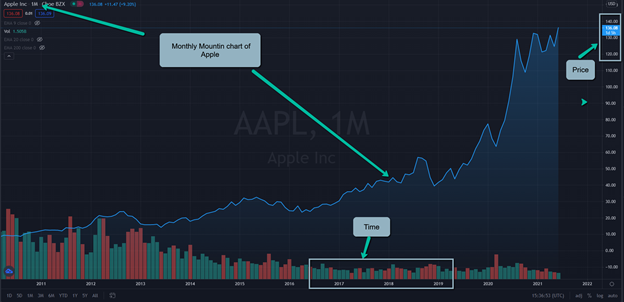
Month Mountain Chart
In the mountain chart the blue line signifies the daily changes in price, while the red and green bars at the bottom signify the daily trading volumes. When the bar is red the volume is falling, and green is when the volume is increasing.
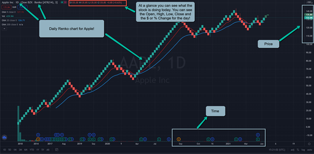
Daily Renko Chart
Each little square in the Renko Chart signifies the closing price on that day. When it’s red that means the stock price closed at a lower price than where it started that day. Green is the opposite, that means it closed higher than where it opened. Over time you can see the prices will either follow an upward or downward trend. Don’t forget that prices can also move sideways!
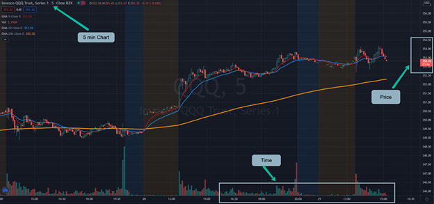
5 Minute Chart
In this chart we are seeing multiple trend lines along with the changes in price over a very short period of time. The more granular you are the more volatility you will see. This level of detail is most useful when you’re getting ready to make a trade and you want to maximize your profits.
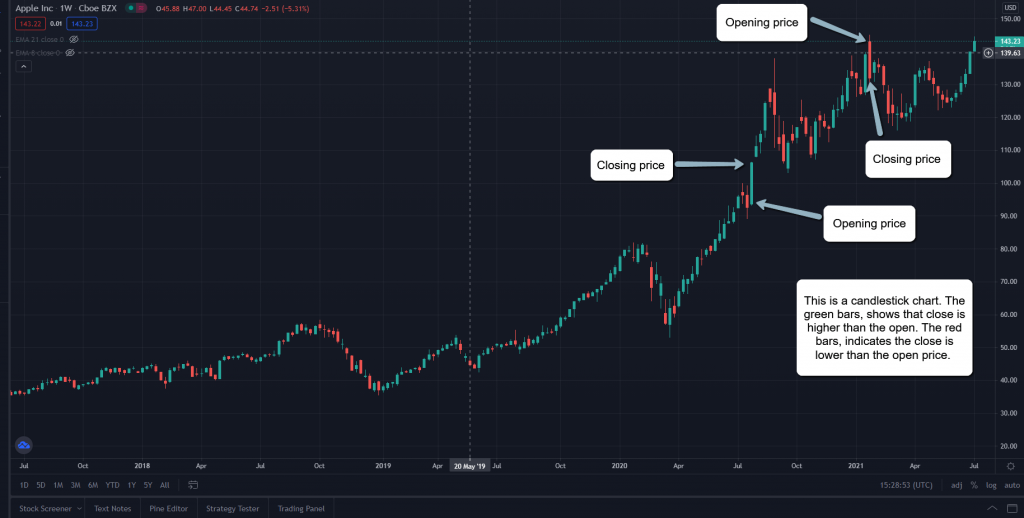
Candlestick Chart
In a Candlestick Chart, the green bars show that the closing price was higher than the open price, and the red bars indicate the close was lower than the opening price. In Chapter 7-08 Candlesticks, we will go over this chart in more detail.
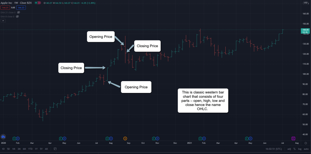
OHLC Chart
This is a classic western bar chart that consists of four parts – open price, the highest daily price, the lowest daily price and the closing price hence the name OHLC. The vertical bar indicates the high and low of that bar’s session. The left horizontal line signifies the opening price and the right horizontal line signifies the closing price of that bar.
Here is another series of charts that is looking just at Apple (AAPL) prices. You can see that even though this is charted on a different platform the information is still displayed the same. Time will always be on the y-axis, and price is on the x-axis.
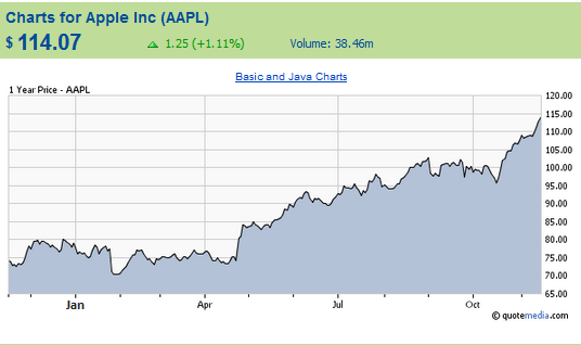
1 Year Mountain Chart
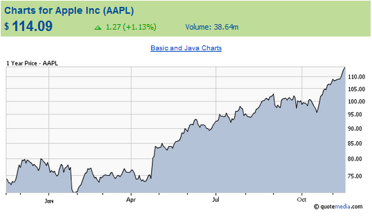
1 Year Mountain Logarithmic Chart
Note how the scaling has changed in the “Y” or vertical axis.
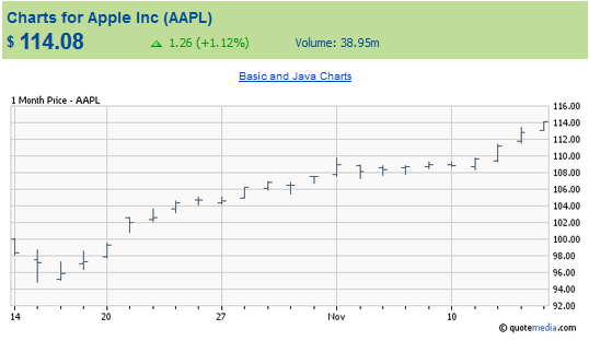
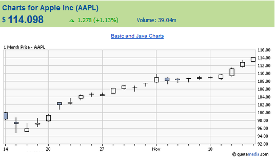
1 Month OHLC Chart
1 Month Candlestick
No one time period is better than another when charting a stock’s price. It all depends on your time horizon. In other words, how long do you intend to hold this stock? Generally, if you are looking for a long-term buy you would want to look at a chart displaying at least 1 year. If you are looking for a quick day trade, then by all means you will need to be looking at a minute by minute chart.
No chart style is any better than the other—it also depends on your time horizon. If you are looking for a quick play, then the OHLC charts will show you the trend by your time interval. But again, if you are looking long-term, the line or mountain chart work equally well.
I generally start off by looking at a 1 year chart with a Mountain graph just to show me where the current stock price is compared to its 52 week high AND its low. Then, I shorten the time period to the last 6-month daily time and change the chart type to the Candlesticks chart. After that I shorten again to the last 30 days, and change the chart type to the OHLC chart and try to determine exactly where I think the stock is headed over the next few days. I always leave my charts on arithmetic scale, unless I am looking at stocks that are really high priced (like GOOG), or stocks that have tripled or more in the time period.
The number and complexity of charts available and their strange-sounding names may overwhelm a new investor. Just relax because no one is expecting you to go from rookie to expert immediately.
As you become more experienced, you will develop many questions to ask yourself as you analyze different charts. At this point in your career, you should consider, at a minimum, these questions as you’re reading and evaluating a chart.
- Are you looking at a stock in an uptrend or a downtrend?
- What are the chart patterns?
- What might follow in the future?
- What do the volume numbers indicate? Is it popular buying or selling?
- Are there gaps or “hiccups” in the current or recent trends?
Read the “legends,” which identify the lines, bars, or other measurement icons. Understand what the chart is displaying and identify the trends and levels shown. For example, in the 1 Day chart above the following numbers are displayed:

Do you know what they mean? Let’s go over them one by one.
- Open: This is the price of the stock when the market opened at 9:30AM U.S. Eastern Time.
- High: This is the highest price of the day.
- Low: This is the lowest price of the day.
- Close: This is the last daily closing price. If the current day is not over, yesterday’s closing price is shown.
- Volume: The total number of shares that have traded that day.
Once you understand the information a stock chart has to offer, you can start to analyze it and see trends of the stocks you’re examining. This is important since price trends are often the reasons that stocks go up or down.
In the following sections, we cover the most popular chart patterns and the ones that seem to have the most consensus as to their validity. You will start to recognize these terms used by experts when referring to these patterns. And yes, even the “big money” on Wall Street is looking for these patterns too!