Discretionary Expenses – Understanding Central Tendency
What Are Discretionary Expenses?
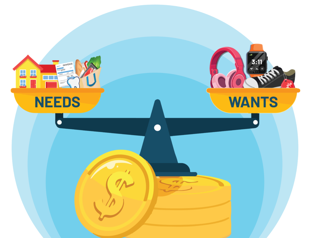
Discretionary expenses are non-essential purchases— wants, things we buy for enjoyment, convenience, or fun. Examples include entertainment, dining out, or the latest tech gadgets. In contrast, needs are essential for survival: food, housing, utilities, and healthcare. Knowing the difference between needs and wants is a key financial skill, especially when you start managing your own money.
Why It Matters
Understanding the difference between needs and wants helps you make smarter financial choices. For example, if you’ve saved up for a new video game but your phone breaks, which do you choose? The phone is a need; the game is a want. Choosing to replace the phone ensures you meet a necessary expense, setting you up for financial security in the long-term.
Analyzing Needs vs. Wants: A Data Approach
Tracking your spending helps reveal patterns in your financial habits. You might track how much you and your friends spend on non-essential items like snacks, entertainment, or apps. By examining this data, you can reflect on whether your spending aligns with your priorities.
In fact, research shows that people who think long-term tend to save more, while those focused on immediate gratification are more likely to overspend. Analyzing your spending data can help you make better financial decisions and build healthier money habits.
Using Central Tendency to Analyze Spending Data
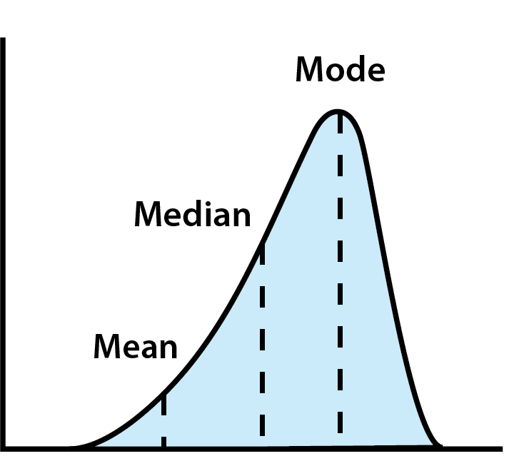
When analyzing spending, three key measures of central tendency—mean, median, and mode—help summarize your financial behavior:
- Mean: The average of all your spending. While useful, the mean can be skewed by extreme values (like someone spending way more or less than others).
- Median: The middle value when all data is arranged in order. This gives a better idea of typical spending by avoiding outliers.
- Mode: The most frequent value. This can help identify common habits or popular trends in spending.
Using Central Tendency to Analyze Spending Data
Looking at central tendency can help put your own budget into perspective. For example, you might buy a coffee every morning on your way to school or work. You realize this can add up, but you think you are spending about as much as the next guy (or girl), so it is a reasonable expense.
But if you actually ask a group of your peers how much they spend, it can give you a bigger perspective of how much you are actually spending each month.
- Mean: If you find out your are spending about as much as the average, then you were right about your own spending habits. But if you find that you’re spending a lot more than everyone else, you might take a closer look at your drink choices.
- Median: The median tells you how your actions fit in with everyone else. Maybe several people spend $0 on coffee – that would skew the mean lower than what the typical coffee drinker spends. In this case, you might see you actually spend less than the median, so your spending is indeed reasonable.
- Mode: The most frequent value. Maybe a group of friends are ordering the same Orange Mocha Frappuccino together every morning – making it the mode choice. If you know the Orange Mocha Frappuccino happens to be pricey, it might mean the median is also skewed higher than what you think a typical coffee drinker is ordering.
Example: Esteban’s Coffee Habit
Esteban buys a $4.75 coffee every morning. While he believes this is a reasonable price, he’s curious to know if it’s typical. To get a better sense of the average cost, he asks his friends, family, and coworkers how much they spent on their morning coffee. These are their responses:

| Respondent | How Much They Spent This Morning |
|---|---|
| 1 | $0.00 |
| 2 | $6.95 |
| 3 | $1.99 |
| 4 | $0.00 |
| 5 | $4.25 |
| 6 | $3.00 |
| 7 | $5.99 |
| 8 | $7.37 |
| 9 | $0.00 |
| 10 | $8.19 |
| 11 | $7.59 |
| 12 | $0.00 |
| 13 | $24.68 |
| 14 | $0.00 |
| 15 | $8.09 |
1. Calculating The Mean
First, Esteban wants to test his first hypothesis – that he is spending about the average of everyone else. So, he would calculate the average, or mean. The formula to calculate the average is:
Mean = sum of observation / count of observations
The formula can also be written in what is called Sigma Notation:

With Sigma Notation, the Sigma sign (Σ) means “add up”, the n sign means how many observations, the x means for a specific observation, and the i means for each observation. So what this is saying is from the first (i = 1, at the bottom of the sigma) to the last observation (to n, which is on top of the sigma), add up all their values, then multiply by 1/n. Sigma Notation is very common in research fields, as it shows algebra or mathematical operations being applied to a whole series of numbers, instead of one at a time.
So we add up all the observations:
$0.00 + $6.95 + $1.99 + $0.00 + $4.25 + $3.00 + $5.99 + $7.37 + $0.00 + $8.19 + $7.59 + $0.00 + $24.68 + $0.00 + $8.09 = $78.10
And divide by 15 (count of observations)
$78.10 / 15 = $5.21
Esteban was right – he is spending less than the mean. His $4.75 is cheaper than the mean value of $5.21.
2. Calculating The Median
To calculate the median, we need to re-arrange the orders from smallest to largest. The median is the middle number.
| Respondent | How Much They Spent This Morning |
|---|---|
| 1 | $0.00 |
| 4 | $0.00 |
| 9 | $0.00 |
| 12 | $0.00 |
| 14 | $0.00 |
| 3 | $1.99 |
| 6 | $3.00 |
| 5 | $4.25 |
| 7 | $5.99 |
| 2 | $6.95 |
| 8 | $7.37 |
| 11 | $7.59 |
| 15 | $8.09 |
| 10 | $8.19 |
| 13 | $24.68 |
The middle value (median) of his friends’, family, and coworkers’ morning coffee expenses is actually $3.00, significantly lower than Esteban’s $4.75. This discovery makes Esteban feel less comfortable about his daily coffee habit. He realizes he’s spending 50% more than his peers, even though his individual cost is below the average price.
3. Calculating The Mode
Last, Esteban wants to see what the most popular choice is. For this, he needs to find the mode. The mode is simply the most common observation. In the case of his survey, 5 people responded $0.00 – making this the most common choice (the mode). While not the majority of the people, this definitely has a big impact on the mean and median choices. Esteban isn’t quite sure what to do with this information – but there is more math to help him find an answer!
Interpreting the Data: Skewness, Outliers, and Distributions
Esteban is looking at problems in his analysis coming from the distribution of his responses – or how his responses look on a graph.
Skew
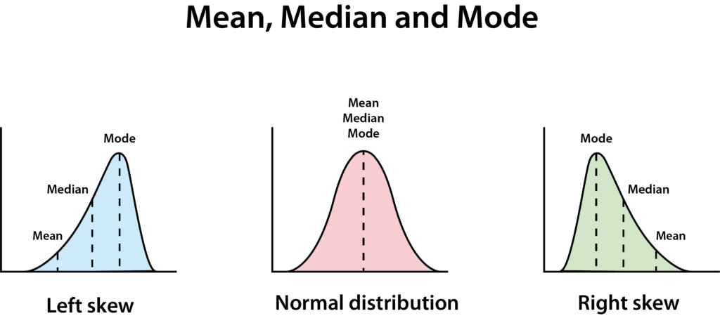
A normal distribution has a clean bell shape. A perfectly normal distribution results in the mean, median, and mode all being equal.
If they are not all equal, it means the data is skewed – in this case, we say that his data has a right-skewed distribution, which means the median is lower than the mean. This often happens when there are few really big or really small numbers, making the chart look like it has a long slide going to the right.
Outliers
When Esteban examines the responses closely, he notices one outlier: a cost of $24.68. This value is significantly higher than any other. Outliers are data points that are far removed from the rest of the group and are often excluded from statistical analysis because they can skew the results.
Upon further investigation, Esteban learns that this outlier represents the cost of a gallon of freshly-squeezed orange juice purchased for that person’s entire family that morning. This expense is clearly not comparable to the typical cost of a single cup of coffee.
Bimodal Distributions
Bimodal distributions happen when you look at the frequency distribution and do not see just one peak, but two (or more). Take a look at these survey responses for how much high school students paid for their lunches on a given day:
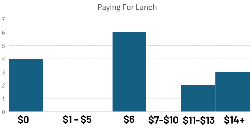
This type of chart, where data is grouped into intervals or ‘bins’ for visual comparison, is called a histogram. The analysis of how observations are distributed within these bins is known as frequency analysis.
Observing the histogram, we notice two distinct peaks: one near $0 and another near $6. This bimodal distribution (with modes near $0 and $6) suggests that there are two distinct groups within the data.
Identifying these peaks can guide further research by prompting questions such as:
- What factors might explain these two distinct spending patterns?
- What do these peaks reveal about the underlying motivations and behaviors of the individuals in these groups?
Furthermore, the presence of these two peaks indicates a right-skewed distribution, meaning that a larger proportion of the data points are clustered towards the lower end of the price range.
Bimodal data does not necessarily mean there are two responses with the exact same number of observations, just that we can see two clear peaks (in this case $6 is the “True Mode”).
When researchers looked more closely into the data, the explanation became obvious. $0 was students who brought a packed lunch from home and $6 was the cost of the regular school lunch. Students who paid more than $10 were buying a combination of items from the school’s snack bar, and other foods that they bought on the way to school.

Conclusion: Using Data to Make Better Financial Decisions
By understanding these three measures of central tendency: mean, median, and mode, you can interpret data and make more informed financial choices. Whether you’re analyzing your spending or looking at larger trends, these tools empower you to develop better money habits. Collecting and analyzing spending data can provide insight into your financial behavior.
For students like Esteban, simple changes—like cutting back on discretionary purchases—can lead to long-term financial benefits. When Esteban sees that his spending is above the median – and that the most popular choice is to not spend at all, it helps put context on his spending decisions and what that means for his future.